Tuesday, 28 February 2012
Drafts of Ancillary Tasks
this is the logo I have created which I plan to use within my DVD cover, my magazine cover and within my actual trailer.
this is my first draft of my DVD cover, i have used a patterned background similar to those used in exsisting products, a main image of the characters and child like fonts to show it is for children, i have also used a logo of an exsiting company that produces childrens tv dramas to show that this product is similar to those already exsisting
this is my first draft of my magazine cover, i have used a patterned background which is bright in colour as it is similar to one i have used on the DVD cover & also bright colours is what attracts the target audience. I have also used easy to read fonts so that the target audience can read them easily & also have included coverlines that would interest them
To see how my target audience responds to them I have asked on social network sites such as twitter and facebook to have a look at these drafts so I can get an appropriate response as most people from my target audience have facebook and twitter.
this is my second draft of my magazine cover, I have changed the background as the other background was too distracting, I added subheading to add more detail to my coverlines and added different fonts to make it more eye catching
this is my second draft of my dvd cover, I have added a backpage to it so I could add more details to it, like running time and other technological features, DVD extras and a blurb to get the audience interested in the DVD. I have yet to add pictures to this draft as I need to be able to photoshop my photo better than in the 1st draft. I have added stars to the front cover as this is similar to my magazine cover and the audience would be familar with this as well as the logo used throughout. I also added copyright information at the bottom and a certificate rating.
This is the 3rd draft for my magazine cover, I changed the background to a similar colour to one I used on the DVD cover as the audience would find this familar, I moved the coverlines around to fit the conventions of a magazine more and changed colours and fonts of the 'Free Gift' section so they were similar to the fonts and colours of the DVD cover and easier to read.
INSTITUTIONS
Nickelodeon is an American children's channel owned by Viacom and operated under its Nickelodeon Kids and Family Group. It first lauched in 1977 under the name 'The Pinwheel Network' until 1979 when they changed the name to nickeloden. The channel is primarily aimed at children in grade school and early teens (ages 6–14) It is broadcast at many different locations around the world including America,Europe, Asia, Africa & Austrailla.
It currently broadcasts many different type of programmes all aimed at children varying from Animations, Sitcoms and Drama. Current programming on Nickelodeon includes SpongeBob SquarePants, iCarly, The Fairly Oddparents, Victorious, Big Time Rush and the House of Anubis with reruns of Rugrats, The Adventures of Jimmy Neutron: Boy Genius, All Grown Up!, Zoey 101, Drake and Josh, Kenan and Kel and Saved By The Bell.
Nickeloden has many sister channels including nicktoons, nickjr and teennick. This is so the shows are avalible amongst many different channel and a wide range of audiences. From nickeloden many other platforms are avalible including Nickelodeon Universe (theme park) Nickelodeon Animation (anitmation studio) Nickelodeon On Sunset (studio of production for series) Nickelodeon Suites Resort (hotel) CruiseNickelodeon (cruise ship)
Nickelodeon Studios (attraction at universal studios orlando & part of production) Nick.com, Nickelodeon Movies (released by Paramount Pictures), Nick Magazine, Nick on demand (online platform to watch nick shows)
Viacom - short for "Video & Audio Communications", is an American media conglomerate with interests in cinema and cable television. As of 2010, it is the world's fourth-largest media conglomerate. Viacom connects with audiences through television, motion pictures, mobile platforms and online in more than 160 countries and territories. Viacom operates approximately 170 media networks reaching more than 600 million global subscribers and more than 500 branded digital media properties.
Disney Channel lanched in 1983 is an American basic cable and satellite television network, owned by the Disney-ABC Television Group division of The Walt Disney Company. The channel specializes in television programming for children through original children's television series and movies, as well as third-party programming. It is marketed mostly toward young children, pre-teens and teenagers ages 9–14. Disney Channel, originally established as a cable channel in the United States, has expanded worldwide. Countries using English Language are South Africa, Southeast Asia, Hong Kong, India, Australia, New Zealand, Middle East, Scandinavia, Baltic states, United Kingdom, Ireland and the Caribbean.
Disney Channel broadcasts original series all aimed at children varying from Animations, Sitcoms and Drama such as Phineas and Ferb, Fish Hooks, Good Luck Charlie, Shake It Up, The Suite Life on Deck and The Wizards of Waverly Place. It sometimes includes re-runs of old shows including Thats So Raven, Lizzie Mcguire, Cory In The House, The Suite Life Of Zac & Cody and Recess.
Sister Channels include Disney XD, Disney XD +1, Disney Channel +1 & Playhouse Disney. this broadcasts different programmes for different audiences and the use of '+1' Channels allows audience to catch up on programmes if they miss them an hour later.
Like Nickeloden, Disney is also avalible of many different platforms like Walt Disney Motion Pictures Group (film studio) disneychannel.com, Disney World, (theme park, resorts in Florida & Paris) Disney Cruise Line (cruise line) Walt Disney Animation Studios, Walt Disney Studios, Disney On Demand (online programme streaming) as well as many different merchandise branches.
The Walt Disney Company is an American multinational media conglomerate, It is the largest media conglomerate in the world in terms of revenue. Founded on October 16, 1923, Walt Disney Productions established itself as a leader in the American animation industry before diversifying into live-action film production, television, and travel. Taking on its current name in 1986, The Walt Disney Company expanded its existing operations and also started divisions focused upon theatre, radio, publishing, and online media.
A small insitution is CITV (short for Children's ITV) is a British television channel from ITV Digital Channels Ltd, a division of ITV plc. It is broadcast just in Britian. The CITV channel is an extension of the original afternoon children's programming block shown on the ITV channel. "Children's ITV" began in January 1983 and originally featured pre-recorded in-vision continuity links fronted by various presenters and characters from Children's ITV programmes.
CITV shows programmes such as My Parents Are Aliens, Jungle Run, Art Attack, Horrid Henry, Bookaboo and The Cool Stuff Collective. This branch has a slot on channel ITV and also it's own TV channel on sky.
ITV plc - a British media company that operates 12 of the 15 regional television broadcasters that make up the ITV Network, the oldest and largest commercial terrestrial television network in the United Kingdom. ITV plc is divided into three divisions: Broadcasting, which operates the TV networks (including the ITV News Group, which runs the ITV regional franchises); ITV Studios, which comprises both UK and international production, ITV's facilities businesses and Global Entertainment which exploits programme rights, and Commercial & Online, which runs itv.com and the ITV Player, ITV's advertising sales arm and has responsibility for ITV plc's shareholdings in Freeview, Freesat, SDN and YouView.
Wednesday, 4 January 2012
PITCH
Throughout the process of research & planning I have been able to find out the conventions of children's tv drama title sequences.
usually they:
- Use visual effects in editing to make it more eye catching and interesting to watch for the target audience
- Feature the main characters of the programme, the main characters are usually of the same age as the target audience
- Include either names of characters or names of actors
- Use montages of footage to create the title sequence
- Use upbeat music as to set the mood of the programme
- Use bright colours to make it eye catching and attractive
- Props that are relatable to the target audience
From my target audience I found out that:
- they like the use of bright colours because they are eye catching
- they prefer the use of character names rather than actor names in a title sequence as it allows them to know they name of the character before they watch it
- they like a mix of different genders for main characters
- they like the use of upbeat music
- like the use of visual effects as it makes things more interesting
- they like a short title sequence else they loose interest in it
For my product I plan to:
have either 4 or 5 main characters that all go to the same school & are friends but have completely different personalities & interests. I want to try & use 3 girls & 2 boys.. this adds diversity and can appeal to both male & female target audiences.
One of the characters could be a sporty type, who wears trackies and plays with a ball to show he's sporty
Another character would be a popular type, who wears a desinger brands, with a mirror and lipstick to show she is concious about her image - this would stereotypically be a female character.
Character 3 would be a nerd type, who carrys alot of books & writes with a pen to show they are studying - this character would be a female character
character 4 would be a quiet type, always has her head buried in a book, to show shes isolated and quiet - this character would be female
finally characer 5 would a be mischievous type character, throws a paper areoplane about to show how naughty they are - this character would be male.
I plan to film between 5 - 10 seconds of each character and then a frame with all 5 characters in to show they are all friends, I shall put all these frames together to create a montage type sequenceI plan to film between 5 - 10 seconds of each character and then a frame with all 5 characters in to show they are all friends, I shall put all these frames together to create a montage type sequence.
My product will be successful as I will include conventions of children's tv drama sequences and also include what my target audience liked because this way it will follow the conventions of media but also appeal to the target audience.
To do this I plan to:
- create between 30 seconds - 1 minute of title sequence
- include upbeat music to set the mood of the drama
- get the characters I use to dress in school uniform so its familiar to the target audience
- use bright colours
- use the props such as the mobile phone, to show that the characters are of similar age of the target audience
- try to use visual effects such as shape transitions between each character introduction
For my product I also have to create two pieces of print media, A DVD cover & A magazine cover
The conventions of a DVD cover for a TV drama for children are:
- use of bright colours
- simple layout
- simple but attractive font types & colours
- one main image of characters or main character
- Logo of company producing it to create convergence
Judging by the answers my target audience gave to my survey about the tv drama sequences I can make a prediction from these results that my target audience would like:
- use of bright colours that would appeal to both male & female audiences
- eye catching fonts similar to ones used on the title sequence
- main image of characters as it would be familiar to them
The conventions of a magazine cover aimed at Children are:
- One main image of characters plus small other images that are relevant to coverlines
- Bright colours
- Scattered coverlines but a minimal amount of them
- 'curly' fonts
- hotspots focused around main image
- masthead
Judging by what my target audience answered my survey with, I can tell that they would like:
- Bright colours
- Main image of all the characters
- Minimal coverlines - as they felt that the only writing needed for the title sequence were the character names so they aren't keen on reading a lot.
For draft work I have created draft layout, colours & fonts for both the dvd cover & magazine covers
usually they:
- Use visual effects in editing to make it more eye catching and interesting to watch for the target audience
- Feature the main characters of the programme, the main characters are usually of the same age as the target audience
- Include either names of characters or names of actors
- Use montages of footage to create the title sequence
- Use upbeat music as to set the mood of the programme
- Use bright colours to make it eye catching and attractive
- Props that are relatable to the target audience
From my target audience I found out that:
- they like the use of bright colours because they are eye catching
- they prefer the use of character names rather than actor names in a title sequence as it allows them to know they name of the character before they watch it
- they like a mix of different genders for main characters
- they like the use of upbeat music
- like the use of visual effects as it makes things more interesting
- they like a short title sequence else they loose interest in it
For my product I plan to:
have either 4 or 5 main characters that all go to the same school & are friends but have completely different personalities & interests. I want to try & use 3 girls & 2 boys.. this adds diversity and can appeal to both male & female target audiences.
One of the characters could be a sporty type, who wears trackies and plays with a ball to show he's sporty
Another character would be a popular type, who wears a desinger brands, with a mirror and lipstick to show she is concious about her image - this would stereotypically be a female character.
Character 3 would be a nerd type, who carrys alot of books & writes with a pen to show they are studying - this character would be a female character
character 4 would be a quiet type, always has her head buried in a book, to show shes isolated and quiet - this character would be female
finally characer 5 would a be mischievous type character, throws a paper areoplane about to show how naughty they are - this character would be male.
I plan to film between 5 - 10 seconds of each character and then a frame with all 5 characters in to show they are all friends, I shall put all these frames together to create a montage type sequenceI plan to film between 5 - 10 seconds of each character and then a frame with all 5 characters in to show they are all friends, I shall put all these frames together to create a montage type sequence.
My product will be successful as I will include conventions of children's tv drama sequences and also include what my target audience liked because this way it will follow the conventions of media but also appeal to the target audience.
To do this I plan to:
- create between 30 seconds - 1 minute of title sequence
- include upbeat music to set the mood of the drama
- get the characters I use to dress in school uniform so its familiar to the target audience
- use bright colours
- use the props such as the mobile phone, to show that the characters are of similar age of the target audience
- try to use visual effects such as shape transitions between each character introduction
For my product I also have to create two pieces of print media, A DVD cover & A magazine cover
The conventions of a DVD cover for a TV drama for children are:
- use of bright colours
- simple layout
- simple but attractive font types & colours
- one main image of characters or main character
- Logo of company producing it to create convergence
Judging by the answers my target audience gave to my survey about the tv drama sequences I can make a prediction from these results that my target audience would like:
- use of bright colours that would appeal to both male & female audiences
- eye catching fonts similar to ones used on the title sequence
- main image of characters as it would be familiar to them
The conventions of a magazine cover aimed at Children are:
- One main image of characters plus small other images that are relevant to coverlines
- Bright colours
- Scattered coverlines but a minimal amount of them
- 'curly' fonts
- hotspots focused around main image
- masthead
Judging by what my target audience answered my survey with, I can tell that they would like:
- Bright colours
- Main image of all the characters
- Minimal coverlines - as they felt that the only writing needed for the title sequence were the character names so they aren't keen on reading a lot.
For draft work I have created draft layout, colours & fonts for both the dvd cover & magazine covers
Focus Group
The result I got from my questionnaire showed that my target audience were aged between 7-16, using these results I decided to do a focus group so I can find out what makes a popular programme for my target audience, this way I can make my own title sequence based on their preferences. To do this I showed a group of 7-16 year olds the title sequences of the programmes I had previously analysed
DRAKE & JOSH:
- Liked the programme title at the beginning as it made it clear what programme they were watching
- Didn't like the use of actor names and would have preferred character names instead
- Thought that the title sequence perhaps dragged on a bit too long
- Liked the use of bright green & blue for the colours on the title sequence
- Thought that the arrow shapes were eye catching for the transitions of each section
- Generally liked the mix of different gender characters, although some thought that it seemed a bit more bias to male characters.
Thats So Raven:
- liked the use of the bright colours at the beginning as they were eye catching
- thought that the title sequence was a bit boring as it didn't have different shapes between characters and just showed different footage.
- thought that it would have been better to show character names rather than actor names as they felt the information was irrelevant
- liked the mixed gender characters
- thought that the music was relevant to the idea of the show because of the lyrics and was upbeat
Zoey 101:
- liked the shot transitions as the shapes and colours made it eye catching and interesting, some would have liked some 'girly' colours as they thought that blue seemed 'boy-ish'
- liked the mixed gender characters, thought the mix of characters made it more appealing because it wasn't biased to one gender.
- liked the use of an upbeat pop song as the music
- would of preferred character names instead of actor names, but liked how they introduced 'the main character' as 'zoey'
- thought that the montage of clips helped set the scene of a school and established a little bit about the characters before watching the show
DRAKE & JOSH:
- Liked the programme title at the beginning as it made it clear what programme they were watching
- Didn't like the use of actor names and would have preferred character names instead
- Thought that the title sequence perhaps dragged on a bit too long
- Liked the use of bright green & blue for the colours on the title sequence
- Thought that the arrow shapes were eye catching for the transitions of each section
- Generally liked the mix of different gender characters, although some thought that it seemed a bit more bias to male characters.
Thats So Raven:
- liked the use of the bright colours at the beginning as they were eye catching
- thought that the title sequence was a bit boring as it didn't have different shapes between characters and just showed different footage.
- thought that it would have been better to show character names rather than actor names as they felt the information was irrelevant
- liked the mixed gender characters
- thought that the music was relevant to the idea of the show because of the lyrics and was upbeat
Zoey 101:
- liked the shot transitions as the shapes and colours made it eye catching and interesting, some would have liked some 'girly' colours as they thought that blue seemed 'boy-ish'
- liked the mixed gender characters, thought the mix of characters made it more appealing because it wasn't biased to one gender.
- liked the use of an upbeat pop song as the music
- would of preferred character names instead of actor names, but liked how they introduced 'the main character' as 'zoey'
- thought that the montage of clips helped set the scene of a school and established a little bit about the characters before watching the show
Thursday, 15 December 2011
PRINT MEDIA
DRAFT DVD COVERS:
For my draft dvd covers, I made 3 different drafts using ideas from each of the 3 dvd cover I originally analysed for my research, for each draft I experimented with the use of bright colours and patterns as from my research I found that most children's dvds used bright eye catching colours and patterns to attract attention from the audience, for my drafts I used oranges, purples & blues as I thought these colours were sutiable for both male & female audiences but were eye catching enough. I tried 3 different layouts, one with an image allined to the left, with the dvd title and series number on the right, also with a company logo at the bottom right hand corner. I feel that although this layout isn't too cluttered having an image on the left hand side wouldn't be big enough to have more than one character in an image so would work best if the image had one character in which my dvd cover wouldn't. Another layout i tried was the image being in the middle of the page with the dvd name at the top, and company logo at the bottom right hand side. I like this layout the most as it is set out in a way that is eye catching but isn't too cluttered, the image of the characters is the main focus as it is in the centre of the page, it is the first thing the target audience would look at and recognise the characters from the tv show. The name of the dvd at the top also is an important feature as following the route of the eye, it is what you would read first then followed by the image and then the company logo which is in the exit areas this shows that it isnt a really important feature but people still do read it. The final layout i tried has one main image and 4 other images, a dvd name & series at the top & a company logo at the bottom right hand corner. I think that this layout is too cluttered due to the use of 5 images, although the audience would recognise the characters their isn't a need for more than one image as one image itself would be recognisable. The use of both DVD name & series number at the top is an important feature to me so the target audience & their parents know it is the right dvd they are buying, it being at the top shows that it is the first thing they read.
For my draft magazine covers I experiemented with 3 layout types which were similar to the ones I analyised in my research, with this I also experiemented with colours & fonts, I used oranges & yellows because they were bright and eye catching & also because they could appeal to both male & female audiences as it is a gender nuetral colour. I also used fonts such as comic sans & ariel as these are both 'childlike' fonts, they are 'curly' type fonts which would appeal more to a child than a 'non-curly' type font as 'curly' fonts are more fun & look nicer to a child. The first layout i used was a masthead at the top of the page, a main image as a background, a colour block at the side with scattered coverlines around the magazine and a company logo at the bottom. I've used this order because it is easy to follow using the route of the eye and also used a colour block to break up the image a bit more so it is more eye catching, also the company logo is added to show it is part of that company but not a main feature of the magazine. the coverlines are scattered as it draws more attention to each one and also make them more interesting to look at. The second layout i used has a masthead at the top, main image background and scattered coverlines, for me this isn't a very effective layout out as it isn't very eye catching, to make this more eye catching i would add a pug to it so it stands out. the scattered coverlines would help make it more appealing as it isn't ordered but the main problem is that there isn't alot of colour on there making it very boring. My final layout has a block colour at the bottom, a masthead at the top, main image background and ordered coverlines, the block colour helps make the cover more eye catching and interesting as it is different and not the same all the way through, for me the ordered coverlines make it very boring as all the text is one big chunk. I think in order to make a good magazine cover I need to use a area of block colour as well as a main image so there is more than one thing to look at, i need to use scattered coverlines so they are easier to read and not in one big chunk and i need to add a pug to add more eye catching details and a masthead that people would recognise from the tv show.
For my photography, I have decided that I only need one or two images of the group of people I plan to use, one for my DVD cover & one for my Magazine cover. This is because I only need more main image for each and using a group picture shows all the characters and makes it familiar to the audience. I thought by using two different main images, for example it could be different with the group pulling a different pose, that you could then tell that the DVD cover has one image & the magazine cover has another and therefore is different
For my draft dvd covers, I made 3 different drafts using ideas from each of the 3 dvd cover I originally analysed for my research, for each draft I experimented with the use of bright colours and patterns as from my research I found that most children's dvds used bright eye catching colours and patterns to attract attention from the audience, for my drafts I used oranges, purples & blues as I thought these colours were sutiable for both male & female audiences but were eye catching enough. I tried 3 different layouts, one with an image allined to the left, with the dvd title and series number on the right, also with a company logo at the bottom right hand corner. I feel that although this layout isn't too cluttered having an image on the left hand side wouldn't be big enough to have more than one character in an image so would work best if the image had one character in which my dvd cover wouldn't. Another layout i tried was the image being in the middle of the page with the dvd name at the top, and company logo at the bottom right hand side. I like this layout the most as it is set out in a way that is eye catching but isn't too cluttered, the image of the characters is the main focus as it is in the centre of the page, it is the first thing the target audience would look at and recognise the characters from the tv show. The name of the dvd at the top also is an important feature as following the route of the eye, it is what you would read first then followed by the image and then the company logo which is in the exit areas this shows that it isnt a really important feature but people still do read it. The final layout i tried has one main image and 4 other images, a dvd name & series at the top & a company logo at the bottom right hand corner. I think that this layout is too cluttered due to the use of 5 images, although the audience would recognise the characters their isn't a need for more than one image as one image itself would be recognisable. The use of both DVD name & series number at the top is an important feature to me so the target audience & their parents know it is the right dvd they are buying, it being at the top shows that it is the first thing they read.
For my draft magazine covers I experiemented with 3 layout types which were similar to the ones I analyised in my research, with this I also experiemented with colours & fonts, I used oranges & yellows because they were bright and eye catching & also because they could appeal to both male & female audiences as it is a gender nuetral colour. I also used fonts such as comic sans & ariel as these are both 'childlike' fonts, they are 'curly' type fonts which would appeal more to a child than a 'non-curly' type font as 'curly' fonts are more fun & look nicer to a child. The first layout i used was a masthead at the top of the page, a main image as a background, a colour block at the side with scattered coverlines around the magazine and a company logo at the bottom. I've used this order because it is easy to follow using the route of the eye and also used a colour block to break up the image a bit more so it is more eye catching, also the company logo is added to show it is part of that company but not a main feature of the magazine. the coverlines are scattered as it draws more attention to each one and also make them more interesting to look at. The second layout i used has a masthead at the top, main image background and scattered coverlines, for me this isn't a very effective layout out as it isn't very eye catching, to make this more eye catching i would add a pug to it so it stands out. the scattered coverlines would help make it more appealing as it isn't ordered but the main problem is that there isn't alot of colour on there making it very boring. My final layout has a block colour at the bottom, a masthead at the top, main image background and ordered coverlines, the block colour helps make the cover more eye catching and interesting as it is different and not the same all the way through, for me the ordered coverlines make it very boring as all the text is one big chunk. I think in order to make a good magazine cover I need to use a area of block colour as well as a main image so there is more than one thing to look at, i need to use scattered coverlines so they are easier to read and not in one big chunk and i need to add a pug to add more eye catching details and a masthead that people would recognise from the tv show.
For my photography, I have decided that I only need one or two images of the group of people I plan to use, one for my DVD cover & one for my Magazine cover. This is because I only need more main image for each and using a group picture shows all the characters and makes it familiar to the audience. I thought by using two different main images, for example it could be different with the group pulling a different pose, that you could then tell that the DVD cover has one image & the magazine cover has another and therefore is different
Tuesday, 13 December 2011
AUDIOVISUAL MEDIA:
Outline:
The outline for my title sequence is to have either 4 or 5 main characters that all go to the same school & are friends but have completely different personalities & interests. I want to try & use 3 girls & 2 boys.. this adds diversity and can appeal to both male & female target audiences.
One of the characters could be a sporty type, who wears trackies and plays with a ball to show he's sporty
Another character would be a popular type, who wears a desinger brands, with a mirror and lipstick to show she is concious about her image - this would stereotypically be a female character.
Character 3 would be a nerd type, who carrys alot of books & writes with a pen to show they are studying - this character would be a female character
character 4 would be a quiet type, always has her head buried in a book, to show shes isolated and quiet - this character would be female
finally characer 5 would a be mischievous type character, throws a paper areoplane about to show how naughty they are - this character would be male.
I plan to film between 5 - 10 seconds of each character and then a frame with all 5 characters in to show they are all friends, I shall put all these frames together to create a montage type sequence.
SHOTLISTS:
For shots I shall use a variety of different shots to make it look interesting and appeal to the target audience
example shot types....
extreme close up: this lets the audience see great detail to certain aspects, in this case an eye
close up: this allows us to see character expression, age & gender of characters.
establishing shot: this allows us to set the scene of where something is set which gives us an idea of what the series could be about.
wide shot: used to show relationships between characters and differentation between character types
The outline for my title sequence is to have either 4 or 5 main characters that all go to the same school & are friends but have completely different personalities & interests. I want to try & use 3 girls & 2 boys.. this adds diversity and can appeal to both male & female target audiences.
One of the characters could be a sporty type, who wears trackies and plays with a ball to show he's sporty
Another character would be a popular type, who wears a desinger brands, with a mirror and lipstick to show she is concious about her image - this would stereotypically be a female character.
Character 3 would be a nerd type, who carrys alot of books & writes with a pen to show they are studying - this character would be a female character
character 4 would be a quiet type, always has her head buried in a book, to show shes isolated and quiet - this character would be female
finally characer 5 would a be mischievous type character, throws a paper areoplane about to show how naughty they are - this character would be male.
I plan to film between 5 - 10 seconds of each character and then a frame with all 5 characters in to show they are all friends, I shall put all these frames together to create a montage type sequence.
SHOTLISTS:
For shots I shall use a variety of different shots to make it look interesting and appeal to the target audience
example shot types....
extreme close up: this lets the audience see great detail to certain aspects, in this case an eye
close up: this allows us to see character expression, age & gender of characters.
establishing shot: this allows us to set the scene of where something is set which gives us an idea of what the series could be about.
wide shot: used to show relationships between characters and differentation between character types
PRODUCTION PLAN
for my main task I plan to film at Neale-Wade school as most children's dramas are set in a school and it is easy for me to access, locations within the school I will use is the sixth form common room as it is easy to access and also a location that all my characters will use.
For the costumes the characters will wear everyday clothing, this is to show that they aren't any different from other teenagers so the target audience will be able to relate to them, also the costumes will help the audience tell the difference between characters for example trackies & sports top for sporty character & designer branded cardigan for the popular character. other clothing items woren are leggings, hoodies, jeans and coats, this is to show that they are normal teenagers wearing normal clothing, I have decided to let the characters wear 'normal' clothes as from my research most of the other children's dramas are wearing actual clothes and not uniform.
For the props I shall use things you would assosiate with each character type, for example, a smart character would have lots of books and a pen for writing. a sporty type character would have a ball. a'popular' type character would use a mirror and lipstick to show they are obessessed with their image. a quiet type would use a book to show they are on their own and another character could have a paper aeroplane to throw to show they are mischeivous.
For equipment I shall need a camera to film everything with and also a tripod to ensure my shots are steady and this way I can position the camera how I like. I will also need to use a MAC to upload and edit my work on so I can bring everything together, I shall also use a normal desktop computer to access my work. Two websites I will use are youtube.com to upload my video online & blogger.com to post my video to after I have uploaded it.
For personnel I plan to use:
Lauren Brown as a popular character
Chandré Roman as a quiet type
Tanya Wright as a nerd
Sam Rippington as a sporty type
Joe Davies as a trouble maker
Production Dates:
I plan to start filming around the begining to mid january, this allows me o have enough time to get a first draft together for the first deadline of Febuary 10th.
Risk assessment:
The only risks I can think of at this stage is if using the gym the person who plays the character needs to make sure if they use the gym equipment they use it properly & they don't lift anything that is too heavy for them else they could damage themselves.
Also if filming upstairs the characters need to be careful not to hang off the balacony else they could fall over te edge and seriously hurt themselves.
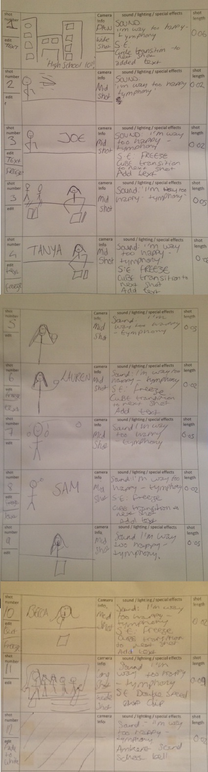
STORY BOARD:
SCRIPT:
[ESTABLISHING SHOT] pan across school setting
EDITING:
'HIGH SCHOOL 101!' text
slide transition; circle to next shot
[MID SHOT] Joe; a trouble maker seen with feet on the table throwing a paper areoplane
EDITING:
FREEZE
'JOE' text
slide transition; cube
[MID SHOT] Tanya; a geek type seen with popular people chucking books at her and hanging her head at her work load
EDITING:
FREEZE
'TANYA' text
slide transition; cube
[CLOSE UP] Lauren; a popular type seen looking in the mirror and applying make up
EDITING:
FREEZE
'LAUREN' text
slide transition; cube
[CLOSE UP] Sam; a sporty type seen playing with a tennis ball
EDITING:
FREEZE
'SAM' text
slide transition; cube
[MID SHOT] becca, a quiet type seen reading a book and 'shh-ing' people
EDITING;
FREEZE
'BECCA' text
slide transition; cube
[WIDE SHOT] the whole gang, seen coming together to show their friendship
EDITING;
FADE TO WHITE
MUSIC: i'm way too happy
school bell
For the costumes the characters will wear everyday clothing, this is to show that they aren't any different from other teenagers so the target audience will be able to relate to them, also the costumes will help the audience tell the difference between characters for example trackies & sports top for sporty character & designer branded cardigan for the popular character. other clothing items woren are leggings, hoodies, jeans and coats, this is to show that they are normal teenagers wearing normal clothing, I have decided to let the characters wear 'normal' clothes as from my research most of the other children's dramas are wearing actual clothes and not uniform.
For the props I shall use things you would assosiate with each character type, for example, a smart character would have lots of books and a pen for writing. a sporty type character would have a ball. a'popular' type character would use a mirror and lipstick to show they are obessessed with their image. a quiet type would use a book to show they are on their own and another character could have a paper aeroplane to throw to show they are mischeivous.
For equipment I shall need a camera to film everything with and also a tripod to ensure my shots are steady and this way I can position the camera how I like. I will also need to use a MAC to upload and edit my work on so I can bring everything together, I shall also use a normal desktop computer to access my work. Two websites I will use are youtube.com to upload my video online & blogger.com to post my video to after I have uploaded it.
For personnel I plan to use:
Lauren Brown as a popular character
Chandré Roman as a quiet type
Tanya Wright as a nerd
Sam Rippington as a sporty type
Joe Davies as a trouble maker
Production Dates:
I plan to start filming around the begining to mid january, this allows me o have enough time to get a first draft together for the first deadline of Febuary 10th.
Risk assessment:
The only risks I can think of at this stage is if using the gym the person who plays the character needs to make sure if they use the gym equipment they use it properly & they don't lift anything that is too heavy for them else they could damage themselves.
Also if filming upstairs the characters need to be careful not to hang off the balacony else they could fall over te edge and seriously hurt themselves.
STORY BOARD:
SCRIPT:
[ESTABLISHING SHOT] pan across school setting
EDITING:
'HIGH SCHOOL 101!' text
slide transition; circle to next shot
[MID SHOT] Joe; a trouble maker seen with feet on the table throwing a paper areoplane
EDITING:
FREEZE
'JOE' text
slide transition; cube
[MID SHOT] Tanya; a geek type seen with popular people chucking books at her and hanging her head at her work load
EDITING:
FREEZE
'TANYA' text
slide transition; cube
[CLOSE UP] Lauren; a popular type seen looking in the mirror and applying make up
EDITING:
FREEZE
'LAUREN' text
slide transition; cube
[CLOSE UP] Sam; a sporty type seen playing with a tennis ball
EDITING:
FREEZE
'SAM' text
slide transition; cube
[MID SHOT] becca, a quiet type seen reading a book and 'shh-ing' people
EDITING;
FREEZE
'BECCA' text
slide transition; cube
[WIDE SHOT] the whole gang, seen coming together to show their friendship
EDITING;
FADE TO WHITE
MUSIC: i'm way too happy
school bell
Subscribe to:
Posts (Atom)