For my draft dvd covers, I made 3 different drafts using ideas from each of the 3 dvd cover I originally analysed for my research, for each draft I experimented with the use of bright colours and patterns as from my research I found that most children's dvds used bright eye catching colours and patterns to attract attention from the audience, for my drafts I used oranges, purples & blues as I thought these colours were sutiable for both male & female audiences but were eye catching enough. I tried 3 different layouts, one with an image allined to the left, with the dvd title and series number on the right, also with a company logo at the bottom right hand corner. I feel that although this layout isn't too cluttered having an image on the left hand side wouldn't be big enough to have more than one character in an image so would work best if the image had one character in which my dvd cover wouldn't. Another layout i tried was the image being in the middle of the page with the dvd name at the top, and company logo at the bottom right hand side. I like this layout the most as it is set out in a way that is eye catching but isn't too cluttered, the image of the characters is the main focus as it is in the centre of the page, it is the first thing the target audience would look at and recognise the characters from the tv show. The name of the dvd at the top also is an important feature as following the route of the eye, it is what you would read first then followed by the image and then the company logo which is in the exit areas this shows that it isnt a really important feature but people still do read it. The final layout i tried has one main image and 4 other images, a dvd name & series at the top & a company logo at the bottom right hand corner. I think that this layout is too cluttered due to the use of 5 images, although the audience would recognise the characters their isn't a need for more than one image as one image itself would be recognisable. The use of both DVD name & series number at the top is an important feature to me so the target audience & their parents know it is the right dvd they are buying, it being at the top shows that it is the first thing they read.
For my draft magazine covers I experiemented with 3 layout types which were similar to the ones I analyised in my research, with this I also experiemented with colours & fonts, I used oranges & yellows because they were bright and eye catching & also because they could appeal to both male & female audiences as it is a gender nuetral colour. I also used fonts such as comic sans & ariel as these are both 'childlike' fonts, they are 'curly' type fonts which would appeal more to a child than a 'non-curly' type font as 'curly' fonts are more fun & look nicer to a child. The first layout i used was a masthead at the top of the page, a main image as a background, a colour block at the side with scattered coverlines around the magazine and a company logo at the bottom. I've used this order because it is easy to follow using the route of the eye and also used a colour block to break up the image a bit more so it is more eye catching, also the company logo is added to show it is part of that company but not a main feature of the magazine. the coverlines are scattered as it draws more attention to each one and also make them more interesting to look at. The second layout i used has a masthead at the top, main image background and scattered coverlines, for me this isn't a very effective layout out as it isn't very eye catching, to make this more eye catching i would add a pug to it so it stands out. the scattered coverlines would help make it more appealing as it isn't ordered but the main problem is that there isn't alot of colour on there making it very boring. My final layout has a block colour at the bottom, a masthead at the top, main image background and ordered coverlines, the block colour helps make the cover more eye catching and interesting as it is different and not the same all the way through, for me the ordered coverlines make it very boring as all the text is one big chunk. I think in order to make a good magazine cover I need to use a area of block colour as well as a main image so there is more than one thing to look at, i need to use scattered coverlines so they are easier to read and not in one big chunk and i need to add a pug to add more eye catching details and a masthead that people would recognise from the tv show.
For my photography, I have decided that I only need one or two images of the group of people I plan to use, one for my DVD cover & one for my Magazine cover. This is because I only need more main image for each and using a group picture shows all the characters and makes it familiar to the audience. I thought by using two different main images, for example it could be different with the group pulling a different pose, that you could then tell that the DVD cover has one image & the magazine cover has another and therefore is different
Outline:
The outline for my title sequence is to have either 4 or 5 main characters that all go to the same school & are friends but have completely different personalities & interests. I want to try & use 3 girls & 2 boys.. this adds diversity and can appeal to both male & female target audiences.
One of the characters could be a sporty type, who wears trackies and plays with a ball to show he's sporty
Another character would be a popular type, who wears a desinger brands, with a mirror and lipstick to show she is concious about her image - this would stereotypically be a female character.
Character 3 would be a nerd type, who carrys alot of books & writes with a pen to show they are studying - this character would be a female character
character 4 would be a quiet type, always has her head buried in a book, to show shes isolated and quiet - this character would be female
finally characer 5 would a be mischievous type character, throws a paper areoplane about to show how naughty they are - this character would be male.
I plan to film between 5 - 10 seconds of each character and then a frame with all 5 characters in to show they are all friends, I shall put all these frames together to create a montage type sequence.
SHOTLISTS:
For shots I shall use a variety of different shots to make it look interesting and appeal to the target audience
example shot types....
extreme close up: this lets the audience see great detail to certain aspects, in this case an eye
close up: this allows us to see character expression, age & gender of characters.
establishing shot: this allows us to set the scene of where something is set which gives us an idea of what the series could be about.
wide shot: used to show relationships between characters and differentation between character types
for my main task I plan to film at Neale-Wade school as most children's dramas are set in a school and it is easy for me to access, locations within the school I will use is the sixth form common room as it is easy to access and also a location that all my characters will use.
For the costumes the characters will wear everyday clothing, this is to show that they aren't any different from other teenagers so the target audience will be able to relate to them, also the costumes will help the audience tell the difference between characters for example trackies & sports top for sporty character & designer branded cardigan for the popular character. other clothing items woren are leggings, hoodies, jeans and coats, this is to show that they are normal teenagers wearing normal clothing, I have decided to let the characters wear 'normal' clothes as from my research most of the other children's dramas are wearing actual clothes and not uniform.
For the props I shall use things you would assosiate with each character type, for example, a smart character would have lots of books and a pen for writing. a sporty type character would have a ball. a'popular' type character would use a mirror and lipstick to show they are obessessed with their image. a quiet type would use a book to show they are on their own and another character could have a paper aeroplane to throw to show they are mischeivous.
For equipment I shall need a camera to film everything with and also a tripod to ensure my shots are steady and this way I can position the camera how I like. I will also need to use a MAC to upload and edit my work on so I can bring everything together, I shall also use a normal desktop computer to access my work. Two websites I will use are youtube.com to upload my video online & blogger.com to post my video to after I have uploaded it.
For personnel I plan to use:
Lauren Brown as a popular character
Chandré Roman as a quiet type
Tanya Wright as a nerd
Sam Rippington as a sporty type
Joe Davies as a trouble maker
Production Dates:
I plan to start filming around the begining to mid january, this allows me o have enough time to get a first draft together for the first deadline of Febuary 10th.
Risk assessment:
The only risks I can think of at this stage is if using the gym the person who plays the character needs to make sure if they use the gym equipment they use it properly & they don't lift anything that is too heavy for them else they could damage themselves.
Also if filming upstairs the characters need to be careful not to hang off the balacony else they could fall over te edge and seriously hurt themselves.
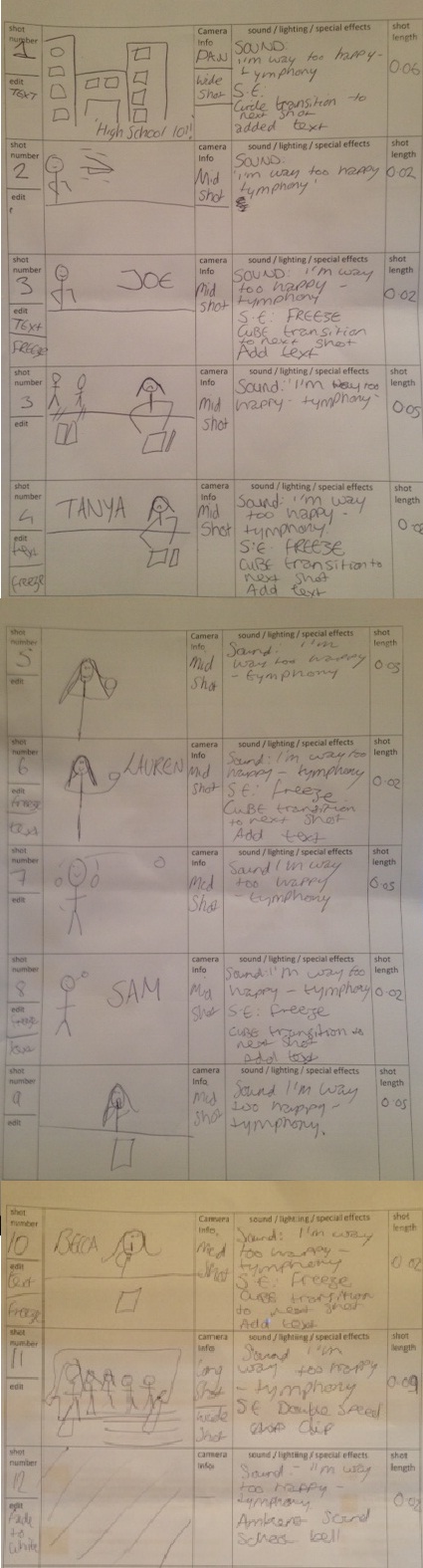
STORY BOARD:
SCRIPT:
[ESTABLISHING SHOT] pan across school setting
EDITING:
'HIGH SCHOOL 101!' text
slide transition; circle to next shot
[MID SHOT] Joe; a trouble maker seen with feet on the table throwing a paper areoplane
EDITING:
FREEZE
'JOE' text
slide transition; cube
[MID SHOT] Tanya; a geek type seen with popular people chucking books at her and hanging her head at her work load
EDITING:
FREEZE
'TANYA' text
slide transition; cube
[CLOSE UP] Lauren; a popular type seen looking in the mirror and applying make up
EDITING:
FREEZE
'LAUREN' text
slide transition; cube
[CLOSE UP] Sam; a sporty type seen playing with a tennis ball
EDITING:
FREEZE
'SAM' text
slide transition; cube
[MID SHOT] becca, a quiet type seen reading a book and 'shh-ing' people
EDITING;
FREEZE
'BECCA' text
slide transition; cube
[WIDE SHOT] the whole gang, seen coming together to show their friendship
EDITING;
FADE TO WHITE
I made a questionnaire and posted it on facebook and twitter, the advantage of using these websites is that most of the people using the websites are roughly the age I need to target for my sequence, twitter especially is useful as you don't know the people on there and is getting responses from people all over the country which makes it a fair representative.
after analysing the results of my questionnaire I found out that my target audience would be between the ages of 7-16, as these are the same age of the viewers that are the target audience for the already existing sequences I analysed as part of my research, Although most of the people who answered my survey were female I shall make sure my sequence appeals to both female & male audiences.
My results showed that my target audience would prefer a title sequence to be:
- 30 seconds or less
- More than one main character, a group of characters rather than it being focused on just one
- Character Names instead of actor names
- Include a programme title
- The main character to be of either sex
- 'Cheesy' music, upbeat and interesting to listen too.
- Bright colours - eye catching
this screenshot shows the first question I asked, I asked them to state their gender as I wanted to see if my results were a fair representation of both genders, Through the survey I found out that most of the people who answered my survey were females, The reason for this being is that because I asked on social networking sites a high percentage of the people i'm 'friends' with or 'following' are female compared to how many are male so my results would be a representation of that.
This second screen shot shows the question I asked about age, this is so I can find out what ages my target audience would be, All of the people who answered this survey were aged between 17-20 which isn't a conventional age for children's tv dramas as I found out from research of similar products, The sites I asked for people's responses for have people on their who are a similar age to me and not pre-teens or teens so that is the reason for the results being slightly bias towards a different audience.
This question I asked as I wanted to know if people who were answering the survey actaully watched children's tv dramas, I also added an option after this question to leave the survey at this point if they answered 'no' as I wouldn't need to know their opinions as they don't watch the shows i'm trying to find further research into. 7 out of 9 people answered 'yes' to watching them so I can find a range of different opinons on childrens tv dramas.
this question I asked to see if they had watched either shows I have analysed or show that I have watched before in the past so I knew what kind of things they would expect from another show similar to ones mentioned, every person on the survey had watched 'Drake & Josh' which is a show that I analysed, from this I can gather that they expect uses of bright colours and shot transitions in the title sequence, for example, as it is something they've already expereienced from watching 'Drake & Josh' and i want to craft something similar.
I asked this question because I wanted to find out about interests of my target audience so that I could incorprate similar themes in my title sequence, most people answered that they like socialising so for my product I can bring the idea of socialising with friends into my title sequence.
I asked this question to allow me to see what sort of things my target audience would expect from a children's tv drama sequence, most said they would like to see the name of the programme in the title sequence, this is an important feature so people know the name of the programme. Another feature that was a popular answer was Character Names, this is also important as people know who the people are without watching the show, this also allows people who haven't watched the show before easily catch up by knowing character names.
I asked this question to find out whether my audience would prefer having one main character or a group of characters, everybody answered with a group of main character, This is the best option as it show diversity and difference between people and doesn't show things from one characters point of view.
I asked this question to find out what gender characters they would like to see, most answered with 'either' showing that would like a mixed group of characters, this is better as can appeal to a much wider audience by showing both genders.
I asked this question to find out how long they would want a title sequence, most answered '30 seconds or less' this is because any longer than that people would lose interest and 30 seconds allows a quick snapshot of what each character is like so they would want to watch and find out more about a character.
Using these results I can then craft my title sequence on what people want.
Using the principle of thirds on the'Hannah Montana' cover in the first third we see hannah's eyes and part of her face, this shows how young she is. in another third it is focused on the pug, the pug is in yellow and purple to make it stand out against the green background, the words 'first time ever on dvd' suggest that it is the first series and also that it is brand new so children would be attracted to it. The hotspots are focused around the 'Hannah Montana' logo and in particular the characters 'H' & 'M' which are her initals, this is recognisable from the TV show and therefore children will be familar with it, the logo stands out from the rest of the cover as it is in different colours of bright purple & yellow compared to everything else. The sub title of 'Living The Rock Star Life' is in bold and in bright green, this is sticking with the colour scheme of the DVD cover as the background is white & green and the colours Hannah is wearing are green & white too. The main image of hannah is one the left hand side which is always the more dominent side so the target audience is instantly atrracted to the image of her she is wearing green & white which keeps to the colour scheme of the dvd, Hannah is also doing a pose of keeping her finger to her lips which if children watch the tv show they will know that she does that because of her other secret life as a normal girl, this pose will be recognisable to them and will know that the DVD is aossisated with the TV show. The disney channel logo is also added to show it is part of the disney company and also children will recognise the logo from watching the show too, both 'Disney' & 'Hannah Montana' are working together to promote each other which is an example of synergy. The yellow & purple colours used are familar from the TV show but also promotes the idea that is for a Female audience rather than a male but the use of green could show that it may be secondarly for a male audience too, the colour white connotes innocence which innocence is associated with children which is a less obvious way of showing that the DVD is for a child target audience.
-----------------------------------
Using the principle of thirds on the 'That's So Raven' cover, in the first third we see the 'Thats so raven' logo which is recognisable from the TV show, it uses bright colours such as red, orange, yellow & white to stand out, also in that third the title of the dvd is in it 'supernaturally stylish' which is in blue which is stereotypically a boys colour which could suggest that the dvd appeals to both boys & girls, it is in a serif font which due to the curly style letters would appeal more to a child audience than an adult one, the words themselves are in a curvy shape rather than a straight line which is also a feature that would appeal to a child and it looks fun and eye catching. the title itself suggests what the dvd is about as raven is a psyhic so that is supernatural and she is also into fashion so children may see that bond as the target audience is for children up to that age of 15 so the older children watching it would make that link rather than the younger children. The hotspots in the principle of thirds are focused around raven's face which is because she is the star of the show, also in the main image itself she is slightly infront of the other two characters suggesting she is the main focus of the show and the other two are just adding to her background. The characters are also all smiling which connotes that the DVD is a happy one and children will see the smiles and know they have to be happy from watching it. The characters wear bright, fashionable clothing, the bright clothing suggest their youth and also the fact they are fashionable show they are mainstream and 'normal' which children can relate too. The disney logo is used in the last third which shows that it isn't an important feature but is also used to show that the DVD is trusted because it's from a well known brand. That's so raven & disney are using synergy just like hannah montana & disney.
-----------------------------------
Using the principle of thirds on 'Zoey 101' dvd cover we can see in the first third the 'Zoey 101' logo which is recognisable from the TV show, it is both purple & blue showing that it could appeal to both a young male & female audience, it is outlined in black to stand out. in the first principle we can see the 'Nickleoden' logo which, as disney has with the other dvds, has used synegy with Zoey 101 to promote each other also the use of the nickleoden logo shows that the dvd is trusted and both child & parent would recognise the brand. The font used is very curly and looks like child-like handwriting which would appeal to the young audience as it looks like something they would write, it is written in black on a white background so it stands out. The hotspots are focused around zoey & chase's head showing that they are the main characters in focus for the show, zoey is a little bit more in front of chase in the compsistion of the shot showing the she is slightly more important even though chase is also a main character, the picture is outlined in white to make it look like a polariod photo you would get in a photo booth which is something that older children would go and do themselves, another set of images at the side is of the other characters in the show, this shows that there is other characters but they aren't as important, all the characters are smiling meaning that it is a happy show and the children watching it will be happy whilst watching it. On the last third there is an image of the school logo that the characters attend this helps set the scene and also helps make the dvd recognisable to the target audience as they would recognise it from the show. The characters wear everyday stereotypical clothing which shows they are teenage and the target audience can relate to this. The background of the DVD is mostly purple & patterned which would appeal more to a female audience than a male audience
Tracey beaker is a magazine for a young target audience, younger than the tv drama sequences I have analysed, which is apparent by the features of it. For example the use of the bright colours such as blue, yellow and pink which are colours assioated with young children, the colours are appealing to both genders, the pink for girls, the blue for boys and yellow being a gender neutral colour. The magazine layout itself is quite cluttered with coverlines and pictures scattered all over the page. The main heading takes up most of the page which makes it eye catching and the font is like 'bubble' writing which is quite child like, it also uses stars and explosions within the main heading which would make it more appealing and eye catching as it is using both words and images. The use an image of the main character Tracey which would make it familiar to the child wanting to buy the magazine as she is recognisable from the tv show, The image is place conventionally in the middle of the page being the main focus around the hotspots. The logo, the character, the fonts and the colours are all used in the title sequence too so the audience would be familar with these and assosiate the magazine and the title sequence together.
The language used is fairly simple to appeal to a young audience, they use words such as 'fab' & 'wicked' which are words usually assosiated with young children and are also positive so the children would think that the activities but with these words will be a good experience. They try and addres the reader directly by using a speech bubble coming from Tracey so that reader wil think that she is connecting with them directly. Other features of a magazine that are included include a price and an issue number, the price is in a small font as the target audience wouldn't be paying for it so it wouldn't be an important feature they would look at to consider buying the magazine as the parents would buy it for them.
Sabrina secrets also uses bright colours, such as pink, yellow and purple which would appeal to a young audience (most likely female) the bright colours are used to section the magazine, purple for the masthead, yellow for the main section where the main image is and pink for one of the coverlines. the layout is quite cluttered with different images and coverlines scattered about the cover. The fonts used are simple and easy to read which would appeal to a young audience as they would be able to read it, the font is a serif font which means it is a curly type font, this makes the font look girly and young which would appeal to the target audience. The text is mostly on the left hand side which leaves the image on the right hand side
The main image is a mid shot of sabrina & her cat, the reader of the magazine would recognise them from the tv show. The other images on the cover are images of young girls which shows what age and gender the magazine is aimed at. Coverlines such as 'Nail-art' 'Make-up' 'Dance' & 'Sleepover Secrets' are another indication that this magazine is aimed at a young female reader are it is something they would want to read about. The route of the eye first goes across 'sabrina the teenage witch' logo which is in the same font and colour used on the TV titles so the target audience would be familar with the logo and it is recognisable. The route of the eye then goes through the various coverlines and the main image and then hits the 'Nail Art Pen' coverline which is also in a pink box so it stands out, the word 'FREE' is in capital letters so it stands out and draws attention to the fact that the nail pen is free, so it would persaude the target audience to buy it more.
Hannah montana magazine is aimed at children who are intrested in hannah montana herself, Hannah montana is a children's tv show about a teenage girl living a double life as a pop star. The target audience for the magazine are young girls as looking at the coverlines for the content of the magazine from the content of the magazine it includes things such as gossip, hair, fashion, crushes and secrets. The use of colour is like the other magazines of using pink, yellow and purple as theses are stereotypical 'girly' colours. this magazine also uses blue which could be used to attract a male audience too as the tv show is suppose to appeal both to the female and male audience. The front cover uses a midshot of Hannah Montana, using this shot allows the reader to see the costume of bright pink t-shirt & belt with a polkadot dress, the bright colours show the age of hannah montana as bright colours are something assosiated with youth. The use of bright colours in the costume also ties into the colour scheme of the magazine. Polkadots are also assosiated with young children. The use of the microphone shows that she is a singer and adds to her character, young girls would also relate to a microphone if they enjoyed singing and dancing like most young girls do. The face that she is pulling shows she is a happy, carefree teenage as she has a big grin on her face. The route of the eye begins with the masthead of the 'Hannah Montana' logo, the logo is the same logo used on the tv show so regular viewers will recognise it from when they watch it on the TV, the logo is glittery and bright which will attract the target audience as it is eye catching and also glittery and bright things are usually assosiated with young girls. The route of the eye then continues across the main image of Hannah Montana and across the left side of the magazine which is filled with coverlines and images of what to expect inside the magazine to draw the reader into buying it, the coverlines and the pug are in bright colours and are used to make them stand out and look exciting, one of them is advertising '3 super posters' this pug is in a pink explosion outlined in yellow to make it stand out against the blue background which would attract the reader to it which they would then want to buy the magazine more when they see they get posters of Hannah Montana in it. The use of the word 'Super' has positive connotations to it and the reader would feel positive from reading the word. The route of the eye then hits the famous Disney logo, the logo would be recognisable to everyone so the children will recognise it from watching the show or watching the disney channel or disney movies in general and also parents will see the logo which if they haven't seen any disney shows before they can take the logo as a reassurance that the magazine is of quality and can be trusted as it is part of disney, the use of the logos not only help the magazine but they advertise the company.
CAMERAWORK:
drake & josh uses two-shots, this shows us that they are the two main characters, they are also brothers so the two shots show the closeness between them
the screen shot above shows an example of a two shot, this allows us to see Josh with his arm around Drake which shows the audience that they have a close relationship, This is also the first shot we see in the title sequence so this would also allow the audience to see that the show is centred around the two brothers and their relationship.
They also use a variety of different close-ups this gives an idea of what the characters are like and also shows the age of the characters.
This screen shot is an example of one of the close ups used, it is shown to show the expressions on Drake & Josh's face, the look is of fear so we can assume that they are scared based on what we see in the close up, this also allows us to see that they are teenage boys which would appeal to the target audience
This is an example of another close up, this shows differentation between Drake, Josh & the character Megan, This allows us to see that she is a female, younger than her brothers and likes a rabbit which is something associated with younger children.
long shots are used to show environment and also the whole body.
this long shot example shows that Drake & Josh are in a chruch because of the stained glassed windows, also it shows them in their boxers which because they are in a chuch would be frowned upon, this would also allow us to see that the boys get into 'crazy' situations which would appeal to the audience.
SOUND:
drake&josh uses a non diegetic pop song in the titles which shows the pace of the show & the age of the target audience it is aimed at. The main character Drake sings the theme tune which would give us an idea of his personality and the type of character he is, it shows us that he is a singer and he likes to play a gituar.
MISE-EN-SCENE:
the characters are wearing clothing stereotypical of their age and their gender which the target audience can relate to because they would be wearing similar things.
they use props such as a stereo & guitar to show that one of the characters is into music, the stereo is stereotypically something that would be in most teenagers rooms so it is an item they can relate too
They also use props such as tables, chairs, beds and other homely items. this helps set the scene of a family environment as it is a show about two brothers.
the above screen shot shows us the bedroom of the boys, which is full of stereotypical teenage things, you can see an amp in the corner which suggests also that one of the boys is into music.
EDITING:
in post production text was added to the titles to show the name of the show & the actors who play them
a background was added of blue and greens which are stereotypically 'boy' colours which as the show is about two brothers adds to the characters, also they are bright colours and bright colours are associated with teenagers.
the montage of clips used are put in arrows are wiped from the screen, this shows the pace of the show and also makes the clips easier to watch as they are arranged in a way that is clear and interesting.
this screen shot shows us the editing effect of the arrows, this makes the title sequence more interesting to watch.
^^ that's so raven
CAMERAWORK:
thats so raven uses a close up to establish each character, this allows us to see facial expressions and also see what the character is like so then it lets us see how the character is like just from the title sequence
for example this close up is used to show raven, the expression on her face is used to show when she is having a 'vision' from using this close up the audience can then tell what is going to happen and when the expression and the close up is used in the show the audience will then be familar that her vision is about to happen.
it uses two shots, this shows that the two character in them have a close relationship so you can understand relationships before even watching the show.
this example of a two shot shows raven and chelsea together, the fact they are standing together shows that they are friends and with chelsea touching ravens arm we can understand that they have a quite a close relationship, the use of this shot helps the audience establish the relationship the two characters have.
It has a long shot of raven's family, this allows us to see that they are a family and that they have a close family dynamic
This shot shows us the closeness of the family as they are all trying to squeeze onto one sofa, the long shot allows us to see each member of the family together which 1) shows us the age, build, gender of each characters & 2) the way the family looks together.
It uses a zoom onto raven's eye this is because her eye shows that she is physic so it zooms onto it to show it is the main focus.
this screen shot shows us of the zoom onto her eye, if you look at the first screen shot I posted for this example you can see that they've gone from a close up of her face to an extreme close up of her eye which you can tell something is about to happen to her eye.
SOUND: thats so raven used non diegetic r'n'b style music, this is because as this is a show about a 'black family' r'n'b style music is usually associated with black people so they use that to help establish the character types.
also the use of the lyrics in the song 'if you could gaze into the future, you'd think life would be a breeze, seeing trouble from a distance but it's not that easy' this helps the audience understand what the show is going to be about before actually watching it, we can tell that raven is psychic and that her character also gets into tricky situations because of her ability.
MISE-EN-SCENE:
thats so raven uses mise-en-scene as high fashion clothes, this is because the main character raven is into fashion. for the other characters they use clothes that are stereotypical for the age & gender of the characters.
other props are used to show what the characters are like, for example victor is seen with chef insturments which shows he is a chef for a living.
lockers are used at the school to show that it is a school, and the school is used to show the characters are of age to go to a school still
this screenshot shows the location of a school, with lockers, water fountain and posters with the characters carrying bags, this gives the impression that it is an ordinary school with ordinary school kids which would relate to the target audience as they are ordinary kids that go to an ordinary school.
they also used props of table, chairs, sofa and pictures of family to help show that it is in a family home, this would be similar to the environment that the target audience would be in.
this shot shows us the family home environement which shows a stair case, photos on the wall and a general family environement which would also create familarity to the target audience as most would come from a family home.
EDITING:
in post production the sequence is edited to have the name of the progamme and coloured shapes at the begining, it is used to show the audience what the programme is and the bright yellow & orange colours are eye catching and make the audience read it.
also a visual effect is used when they show ravens eye, it shows looking straight into her eye to show that she is psychic, this effect is there to show what happens when raven gets a 'vision' its bright colours will also attract the audience and the effect itself will attract the audience as it is out of the ordinary and children like werid things.
this is an example of the effect of raven's eye.
^^ zoey 101
CAMERAWORK:
zoey 101 uses an establishing shot at the beginning of the title sequence, this allows us to see the location and this therefore sets the scene
zoey 101 uses various close ups this allows us to see each character individually which lets us see what each character is like which is also an introduction to each character - the characters are all of a 'teenage' age which is the same age as the target audience which then they would relate to the characters.
SOUND:
zoey 101 uses a non-digetic pop song in the background, this shows the age of the target audience as pop music is associated with young people. The music is fast which shows the pace of the show and could also represent the busy lives of the characters.
The song is called 'follow me' which is sang by the main character actress Jamie Lynn Spears, the song title would suggest that she is the main character as people are suggested to 'follow her' which shows she in the cenre of the series.
MISE-EN-SCE´NE:
One of the characters is wearing a 'PCA' jumper which is the name of the academy the characters attend, this helps show the age of the character and also the setting as it is school clothing.
Each of the characters is wearing stereotypical teen clothing, most of the items are brightly coloured which again shows the age of the characters, the target audience would relate to the items of clothing as it is something they would wear.
They use props such as a laptop, energy drinks, scooter & a basketball to show what each character is like and also these props are stereotypically teenage so they relate to the age of the characters.
EDITING:
all the editing used is put in, in post production:
this title sequence uses montage - putting together different bits of film to create the title sequence.
each bit of film is then put into white boxes which are then 'wiped' from the screen
this makes the footage easier to watch and is also eye catching to the target audience.
a montage is only a few seconds long so it also shows the pace of the show which is similar to the pace of teenage life.
A blue background is also added as part of visual effect in post production, this helps keep the titles eye catching.
Text is also added in post production such as the credits, the name of the show & the logo of the channel it is shown on, this is so the audience knows what the show is, the name of the actors & the name of the channel they are on.